


 |
| The inside page displays information and pictures about the individual projects of the entire London Road project, each section on information is matched with an image of the location. The white headings and black body text worked so much better than that black headings with white body text, the white text clashed with the white edges as well as the picture frames around the image. I liked the idea of having slightly angled images within the leaflet other than "square" images, using the angles meant that i could use slightly different sized images without an individual image standing out. The BN1 in the corner was a late final touch in the design, without it there was no reason to have the folded up corners, they are also a shade of grey instead of black which i used as black was to prominent. |
 |
| The map i decided to use in the end was my perspective drawing that i made up in sketchup which i exported to illustrator to finish up. This worked a lot better than any other of my map designs as it fitted neatly within the space without being to small or obtrusive. My original plan was to either have the map one of the section small and up the correct way, however it made it to small and wasn't visually appealing, my next idea was to have the map across two section but again it didn't look right, there was too much space around the top and bottom and it meant that it would only work when the leaflet was completely un-folded. After a few tries i rotated it and placed it on one section, it fitted perfectly and meant that i could add a title and location points on the map. |
 |


 |
| On this image the sky was originally white, I wanted it to match the previous two so replaced the sky with a nicer rental gradient blue, if i were to use a white logo it would now work on all three. |
 |
| This is the style i have decided on using as my inside pages of my leaflet, i like the folded corner idea as i could use my QR code that i have designed under it, it may not be suitable on the leaflet but defiantly on the adverts. I made these first in illustrator to get the basic shape i then exported to photoshop and added the corner folds. |
 |
| I expanded on the previous design and added a texture and did reversed corners. |


|
| Although i do like the design of this cover, i am not sure if it is engaging and eye catching enough , theres not a lot of content and doesn't really say what the leaflet is about. The purple wood is similar to those of a beach hut and the way in which the gradient has been focused upon the BN1 really makes it stand out better. |
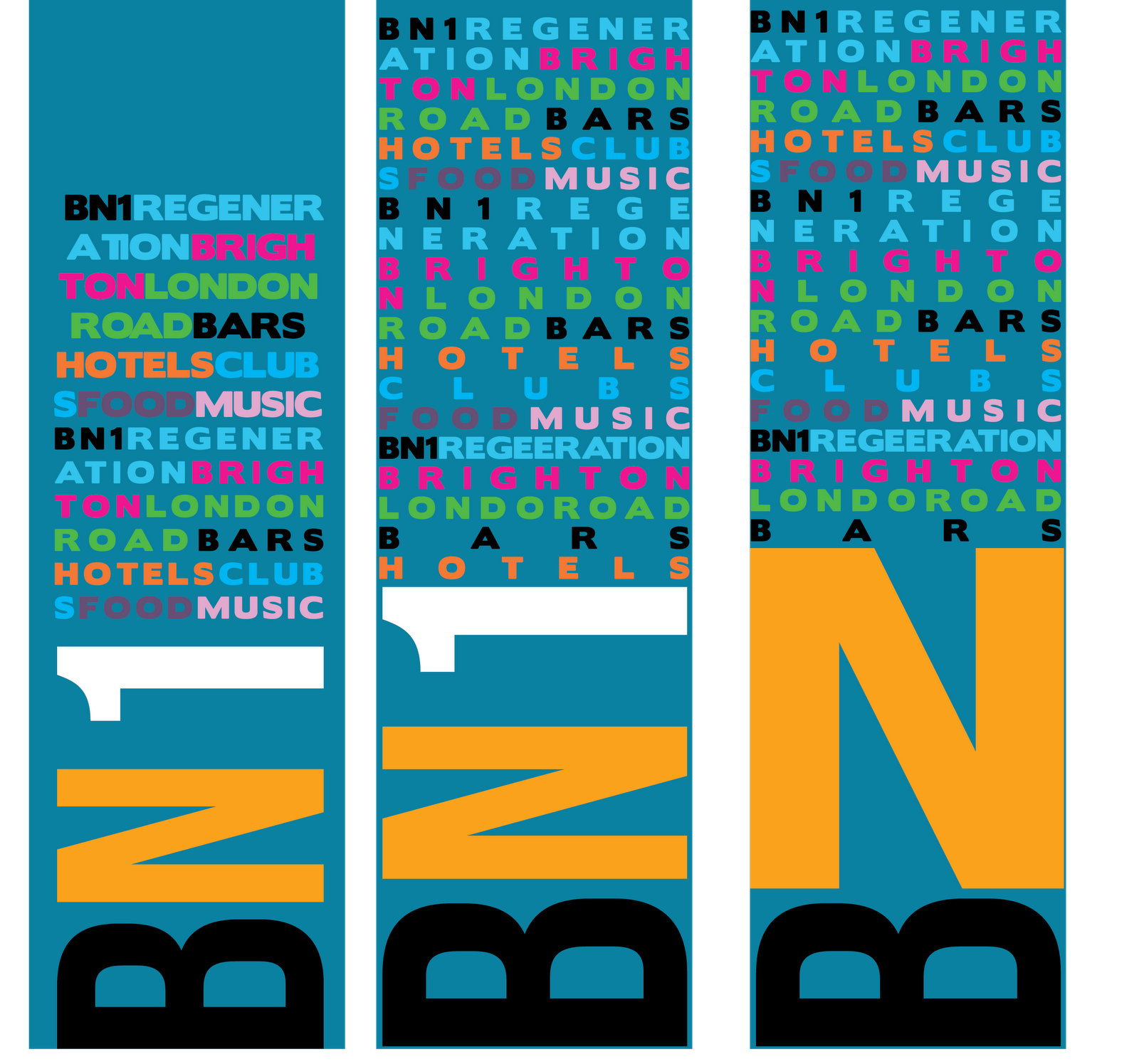 |
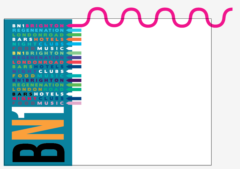
| I have done some work on a completely different design that uses a mixture of words to fill space that are relevant to the regeneration, I prefer the centre one of each of the designs which is a mixture of the other two. I defiantly thing this design is much stronger than the previous as it gets across more information without looking boring, at also follows up on what i looked at by Paul Rand with the multitude of logos and letters which draw your eye in as you look for those certain words/images like a word search. The middle one incorporates the BN1 found on the first but with the larger edge to edge design found on the last. Im not sure that the black works with the other colours as it becomes too prominent, however i could use this as a way of pinpointing certain words in someone would pick up first, even sub-conciously, i think that white would look far more attractive and gives that new appeal. |
 |
| Using photoshops cut out filter and playing with the settings i got a image that i liked the look of hand that would fit into my leaflet ideas. |

 |
| As an experiment i also turned photographs into line drawings, i bought that i could use this as a slightly transparent background with text and images applied over the top. |
 |
| This is the work of Paul Rand, i like how the image is almost a puzzle and i find myself looking for the words and logos imbedded, this is a good way of enticing people in to pick up/read what it is actually about, something like this really look good on the from of a leaflet due to the long and thin pages of a leaflet. |
 |
| This mood board mostly focused on styles and folds of leaflets and how they design worked with that, for example the green leaflet which folds all into the centre, the outside (top) makes up an intricate image that when folded out makes part of the design. |
 |
| the images on the left were found on an existing regeneration site, they tend to use uplifting and positive, bright and clean pictures which promotes the project better than showing dull images with un-happy people. The images on the right were of a leaflet that i was really inspired by, mostly by the unique way of folding the leaflet to show the colour bars down the side. |
| I may edit it slightly as i do not like the City council supported part, its also really far from the main logo and not very balanced. |
 |
| This company deals with the similar regeneration projects, I think that it would be a good idea to include it within my designs. |
 |
| The original buildings were more realistic looking, using the trace settings in illustrator i made them a little more cartoony. Once i had done this it wasn't really the look that i wanted to go for so i went on to explore further. |
 |
| i really liked this style, i planned on having a 2D birds eye view of London road and then having these placed at specific points so that i could say that these are specific buildings in the development, again it wasn't really the look that i wanted to fit in my current ideas.
So i decided to go down the 3D root and learn google sketchup.
I always find it best to start in the deep end and see what the program limitations are, from there i can see how/if the idea will work, the best thing about using 3D is that i can easily have any perspective that i want.
I started off by modelling my workshop as it was something that i could easily visualise.
  
Now that i had learnt the basics i started to draw the part of London road i had selected.
I imported the screen shot of the road then using the tools i traced the buildings, then extruding parts of the contours i made the 3D street, i got some trees to make it look a little more green and friendly and adjusted the lighting so that i got the shadows to cross the street.      |
 |
| These are two potential font that I will use within my design. I like the Bebas neue font, however i do not really think that it could be used as body text because it is not easily read perhaps more as a heading. |
 |
| My my body text i have experimented with Futura, i really like how the letters are matched and the spacings between them make it easy to read for both headers and body. The borisblack font is a potential font for my cover page along with bebas neue. |
 |
| I have been testing the appropriate spacings, leading, pt size and style for my headings to see how they look and work, I'm not a fan of the italic and condensed version but the bold and medium type faces works well together and are easily read. |
 |
| Some testing of readability and style, as well as appropriate heading and body text sizing leading etc. |
 |
| I may have a problem if i used the purple wood, the lines going though it are quite prominent and would most likely interfere with any of the content that i will potentially use. The water droplets again may become a problem with the design due to the depth of field. if i do go for a textured backgrounds i would want to use something that is completely irregular and fill the frame, one idea is grass. |
| This logo is for the hotel I plan on incorporating into my leaflets and/or adverts, the hotel will be called "Bedrocks" |
 |
| This logo is for the flats, I'm by saying executive apartments instead of flats it seems more up market and professional which is what the brief expresses |
 |
| I started to play around with the idea that i would use folded over corners within my designs, i have an idea that it could then reveal a QR code or a small logo, on my leaflet someone had the idea of having BN1...BN2...BN3 on each of the pages like page numbers, however i don't think that it is necessary as it may convey confusion as they could be different post codes, also trying to fit in the "2" and "3" to match the "1" would be a little difficult. |
 |
| This is a bit more of a modern logo, the spacing need some work. |
 |
| This logo is one of my favourite logos that i have designed, the black and white contrast well together, i am neither drawn to the "brighton" or the "london road" but the mixture of the two. |