These are my first designs that I have come up with.
 |
| Although i do like the design of this cover, i am not sure if it is engaging and eye catching enough , theres not a lot of content and doesn't really say what the leaflet is about. The purple wood is similar to those of a beach hut and the way in which the gradient has been focused upon the BN1 really makes it stand out better. |
 |
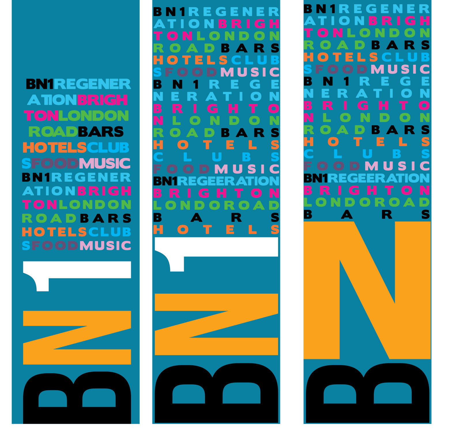
| I have done some work on a completely different design that uses a mixture of words to fill space that are relevant to the regeneration, I prefer the centre one of each of the designs which is a mixture of the other two. I defiantly thing this design is much stronger than the previous as it gets across more information without looking boring, at also follows up on what i looked at by Paul Rand with the multitude of logos and letters which draw your eye in as you look for those certain words/images like a word search. The middle one incorporates the BN1 found on the first but with the larger edge to edge design found on the last. Im not sure that the black works with the other colours as it becomes too prominent, however i could use this as a way of pinpointing certain words in someone would pick up first, even sub-conciously, i think that white would look far more attractive and gives that new appeal. |


No comments:
Post a Comment