On the IBook store I tried to find the most media rich books rather than just text book styled books.
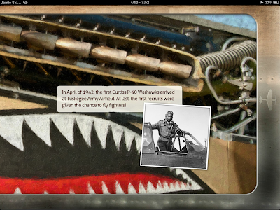
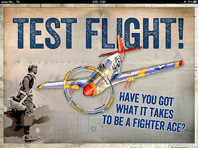
The Aircraft of the Tuskegee Airmen
Warbirds of World War 2
The book is designed in a skeuomorphism way, "creating designs and graphical elements that mimic recognisable objects". http://tinyurl.com/cubnb42
This technique is used a lot in apple apps as well, I think that it creates a very real feeling to the book, it's more textured and interesting and has a sense of depth too it.
I really like the schematic type drawings that are used to accompany the images, It makes the overall image more interesting.
Although the ibook does not have a into video it does have a intro page with audio.
Points to note:
Continuos images on background.
Skeuomorphism themed design.
Full screen gallery pages.
Small finishing touches (objects).
Beatles
Yellow Submarine
This book is the Beatles yellow submarine book, After some research I have found that this is a fixed ebook (epub) publication, a fixed epub is better for more media rich and animated content like children's books as each page can have a specific layout where flexible epub has a continuously flowing format, this means that any text that is enlarged will flow though the entire documents.
 |
| This IBook uses color really well, there is a specific colour pallet that works really well together and is continus throughout the IBook. |
 |
| This page has the butterflies animated, you can also drag them around. |
I mostly looked at this book for interactivity rather than design, I really like how the small touches like the butterflies are not only animated but you can also drag them around. There are quite a few quirky animations which make the page more enjoyable and more interactive. I like all these little touches and want to carry some of these ideas across.
Points to note:
Colourful Ibook style.
Small interactive elements.
E.O. Wilson's
Life on Earth
This is a book that has a lot of interactivity embedded within it. It has some really nice custom made widgets for added interactivity.
Point to note:
Custom widgets
High interactivity
E.O. Wilson's
Life on Earth
This is a book that has a lot of interactivity embedded within it. It has some really nice custom made widgets for added interactivity.
 |
| The image on the right is a 3D object that spins on its own, you can also drag it around to see it from all sides. The widget left i believe is a custom widget made for the ibook rather than a pre-set. |
 |
| It has a timeline like navigation feature, when each circle is clicked it plays a video showing you what happens as you go closer in/over a period of time. I really like this feature, it's clear and easy to use and I very quickly I knew what was going on and how to use the widget. |
 |
| On some videos instead of having them representative of their actual size within the Ibook they have a different cover image that really works well with the design. |
 |
| Another custom widget is this one, when you click on the parts of the ant the top images change . |
 |
| All the photos can be enlarged full screen and also come with a caption. |
 |
| The book has this image of a work surface and when you either click the arrows or on the actual captions you zoom into the page. |
 |
| Each caption takes you to a different part of the picture, I really like this type of widget, it adds a lot of interactivity to the ibook, it would be good for a map as you could zoom into a lot of different places. |
Custom widgets
High interactivity
Overall, these ibooks have given me a lot of inspiration to what possible and what works well, I really like the idea of a skeuomorphism themed design. I think that real textures like leathers and papers would work really well for a lot of designs. High interactivity is something I want to include, these parts are where the user is going to spend a lot of time as it is more engaging than just having text and images nested directly on the page.


No comments:
Post a Comment