
This is what I have come up with from my research and design ideas.
USAF (US) poster 1940's
USAF (US) poster 1940's
Images:
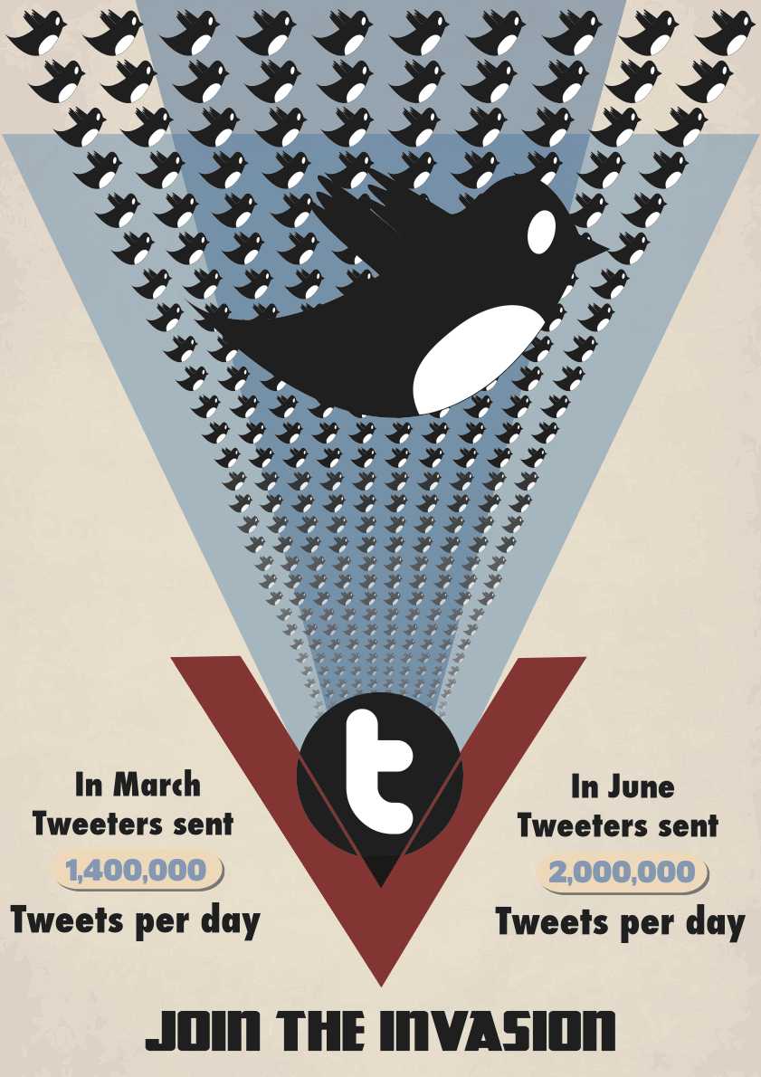
Birds: The bird that i have used is the old generation Twitter logo, I chose this logo over the other newer one as I liked having the white parts to the image and it made the birds stand out further on the background. Using the twitter logo instead of the planes give the feeling that twitter is growing ever so fast and coupled with the text looks as if it is an invasion. To give a sense of depth I have lowered the opacity of the birds at the lower end of the poster, it looks as if they are coming from a distance.
Twitter "T": In the original print there is an image of Roosevelt in the centre, by having this it looks as if the planes come from a central point and person, therefore following the trend i used a Twitter "T" as my central image to show that the invasion is coming from twitter. It took me a while to come up with this style as I played around with different ideas with different imagery.
Old style and others: I have added an old style background texture to the poster to make it look older and roughed up, it works with the blue triangles because they have around 50% opacity, this means that I can see the texture from behind it.
Blue Triangle: The blue triangles that I have used are like the existing poster that kind of represent waves that refer to the years in which planes will be made, following this I have used the same style and changed the opacity of the blue so it shows the background through it and when overlapped it comes darker much like the original.
Red "V": The red "V" creates a kind of door in which the birds look as if they are coming from, it really stands out on the page and points to the tag line.
Faults: I have found a few faults with this poster after I had printed it out at A3 size.
1st. Some of the birds look as if they have been stretched.
2nd. The gaps between the red v and blue triangle are not symmetrical .
3rd. There is a dent in the line of birds.
4th. The red lines that go over the "t" do not line up with the "V"
No comments:
Post a Comment