Monday, 28 November 2011

Evaluation

I have enjoyed this enjoyed this projects, I especially enjoyed learning illustrator and can now see how powerful this piece of software is.

I would not change anything to my final posters I really liked the look and feel of them and I can definitely see that there is a resemblance between my posters and the posters I had decided to change into a 20th century twitter poster.
The posters that I chose were from the 1940's from both a Soviet and United states background, I loved the reds of the Russian posters and how they layed out the different imagery and text together to create a quirky and bold poster that was visually bright and impacting considering that most of the posters from that era used very little colours. The RAF/USAF posters use some unique imagery that is iconic to the period, i could also see a direct link between the colours that the existing posters use and twitter.

If I did this project again I would like to make some more posters from the russian period as I like how the  russian poster looks and how the images are made of of very few colours.
The colours that I chose worked well and really made the posters look as if the were 20th century style propaganda posters, the images that I chose although simple were really effective and fit for there purpose, they also not to complicated that they didn't fit the style. 
I found that it was quick to to create the initial design but finishing it off It took me a while to do as I was playing around with the small details for some time getting the right look and feel, the quickest poster for me was the Twitter "Pigeon" poster as it was a trace of the existing poster. The other Twitter soviet poster took the longest as it was the most built up and I added some small details which took time to draw up and add to the correct places so that the poster looked right.

As these posters were to be to be designed to be able to print at A1 ideally I would have liked to print them up at this size however due to cost I decided A3 would be a good size to proof my work, after printing these I noticed some small variations and faults that I did not see on screen. I now have had a chance to fix these and perfect the posters.

I used solely illustrator for my posters in vector format, using and RGB A3 document in which I would change to CMYK for print. I have also created a full resolution PDF of my posters so that they are "flat" compared to my ai document which has layer which I can edit at any stage.


I felt my presentation went ok, I tried to think from memory and make up on the spot some extra details, this went quite badly and i started stumbling and lost where I was with my notes. I feel that i had good content in my presentation but it would have been far better if i had more notes that I could follow.

From my Crit for my presentation I needed to speed up my transitions and lose some of them as it looked a little messy, i would have also liked to include more detailed sketches and ideas from those i know for next time what I need to do


For my Poster Crit the only thing that I needed to change was on the pigeon poster where I could change the hammer to more of a "t" shape, I would also like to try the poster with the twitter bird as it would then be more associated with twitter.


Overall, I really enjoyed the project and would only change somethings as i have stated if i were to repeat this project.

Crit

The constructive criticism that I got was mostly very good, the only thing that I got was to change the hammer into more of a t-shape to resemble twitter.


Sunday, 27 November 2011

USSR Bird poster Assessment


This is what I have come up with from my research and design ideas.
Soviet Russian style poster 1940's

Images:

Bird: The bird that I have used looks like a pigeon I would like to try the same effect with the twitter bird logo as it would be more associated with twitter. By using the sharp lines together it creates an gradient, this technique was used widely for 20th century posters as a way to create gradients.

Yellow lines: The dark yellow lines here are used to support the text, they create a quirky look to the poster and looks far better than when I had the text situated flat below the bird.

Sickle and Hammer: The sickle and hammer is used to show the posters as old and propaganda style from the 20th century, I think that the hammer and sickle could be a little bolder and thicker so that it looks more impacting.

Old style and others: Again on this poster I have added a brian to the edges so that it looks older, as before this makes the colours a little darker and more associated with the style that I am going for. I like how plain the poster is and how the one image creates an impacting effect.

Faults: I have found a few faults with this poster after I had printed it out at A3 size.
1st. Some of the text is not aligned correctly.

Crit: To perhaps change the hammer into more of a "t" shape to resemble twitter - I like this idea and will change the shape of it to see what it looks like.

USAF (war plane) poster Assessment


This is what I have come up with from my research and design ideas.
USAF (US) poster 1940's

Images:

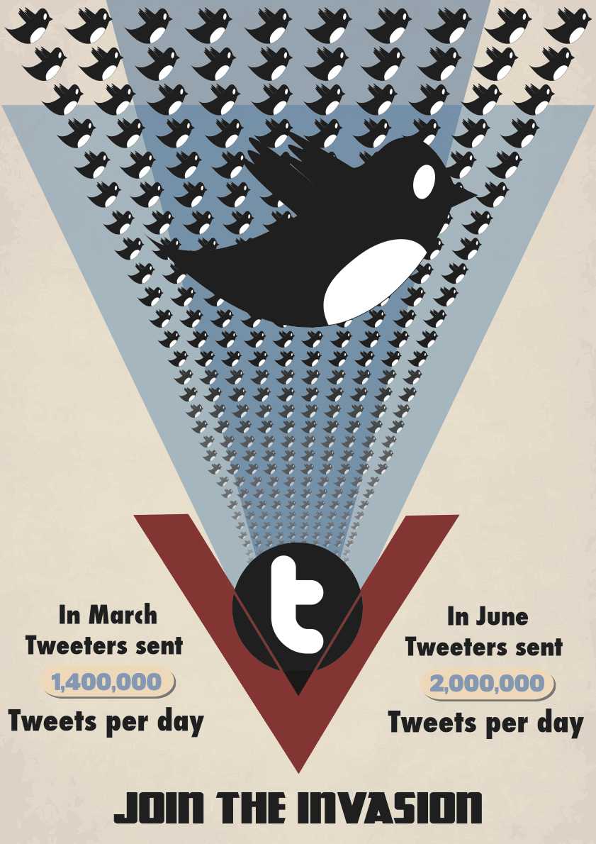
Birds: The bird that i have used is the old generation Twitter logo, I chose this logo over the other newer one as I liked having the white parts to the image and it made the birds stand out further on the background. Using the twitter logo instead of the planes give the feeling that twitter is growing ever so fast and coupled with the text looks as if it is an invasion. To give a sense of depth I have lowered the opacity of the birds at the lower end of the poster, it looks as if they are coming from a distance.

Twitter "T": In the original print there is an image of Roosevelt in the centre, by having this it looks as if the planes come from a central point and person, therefore following the trend i used a Twitter "T" as my central image to show that the invasion is coming from twitter. It took me a while to come up with this style as I played around with different ideas with different imagery.

Old style and others: I have added an old style background texture to the poster to make it look older and roughed up, it works with the blue triangles because they have around 50% opacity, this means that I can see the texture from behind it.

Blue Triangle: The blue triangles that I have used are like the existing poster that kind of represent waves that refer to the years in which planes will be made, following this I have used the same style and changed the opacity of the blue so it shows the background through it and when overlapped it comes darker much like the original.

Red "V": The red "V" creates a kind of door in which the birds look as if they are coming from, it really stands out on the page and points to the tag line.

Faults: I have found a few faults with this poster after I had printed it out at A3 size.
1st. Some of the birds look as if they have been stretched.
2nd. The gaps between the red v and blue triangle are not symmetrical .
3rd. There is a dent in the line of birds.
4th. The red lines that go over the "t" do not line up with the "V"

Soviet poster Assessment


This is what I have come up with from my research and design ideas.
Soviet/Russian 1940s styled poster.

Images:

Bird: The bird that i have used is the current Twitter logo, I have made the twitter bird a striking logo by adding lines that originate from a singular point and expand to the bird, by using the gradients on these lines it further in forces that the bird is coming towards you in a sticking fashion. The bird is my main and vertically central image on my posters which to an audience would instantly recognise as Twitter.

Stars: I have used the main big star to give a more russian look/feel to my poster, by having it off the page it looks as if it could be a stamp and further in forces the soviet look. I have also featured another smaller star to balance my text as without it the text looked out of place and a sharp right angled turn on the page in which i did not want.

People: The people symbolise twitter as a group and coming together for a cause in which twitter does as it is a social media site where people talk and socialise together. The image that I have used looks bold and strong as if they are staving towards something, this is also used in existing 20th century russian posters where they have people reaching towards a goal much like the cosmonaut reaching towards the stars.

Hash key sign: The hash key image works extremely well here, russian posters use all sorts of odd shaped shape and designs, the hash key also reminds me of powerlines something which would fit into this poster to show power, the hash sign for twitter represents categorising and works with the search tool found on twitter in which via searching the word with the hash tag becomes the most relevant term.

Text: The text that I had decided to use in the end after playing around with different designs was: Tweet, Twitter, Trends, IOS, Android and SMS. I have chosen these specific words as when trying out different design layouts the words worked well together, the IOS, Android and SMS are all ways in which you can use twitter.

Old style and others: I have added a grain to the edges of the page to make it seem older it also roughens the poster and changes the colours so that it looks more like a soviet poster. The staggered bars of colour are found in a lot of propaganda posters and symbolise anything from the japanese flag to sun rays.

Faults: I have found a few faults with this poster after I had printed it out at A3 size.
1st. The small star touches the line in between the tweet and twitter text.
2nd. Where all the points of the meet the white line shows through the where it should not.
3rd. I would like to Skew the IOS.SMS.ANDROID text to match the lines that it is on.

USAF layout

Here is the style that I'm going for for my USAF poster:
I like the blue birds but i think that the black ones will fit a lot better and are more like the original poster.
I plan to extend he birds to the outer edges and extend them down to the bottom.


Imagery

I have started to draw up my images in illustrator  that I would and could potentially use within each of my posters.
Above: here i was experimenting with different gradients to see what worked best, some of them the bird almost gets lost in the gradient lines and others it looks to unrealistic for the time and look I am going for.

Above: I have decided that I am going for this bird as the gradient on the lines work well and do not blend into the main icon i am wanting the audience to see.


Above: some more potential illustrations that i may use.

Soviet poster text layouts

Here are some of my text layouts after i had sketched them and decided on the wording, angles and colours to use.


Design Choices

The colours that i am going to use will be this palette for my russian style poster:


I have chosen these colours because they are the same colours used in the russian posters from the time (WW2)  I have been looking at, the colours works well together and are iconic of russian propaganda.


This will then be my colour scheme for my USAF poster:

I have chosen these colours because of the relation between twitter and the USAF poster that I want to develop into my twitter poster, the blues are used in both twitter and USAF propaganda posters and the brown as well as the pale yellow are used in posters for the USAF only as this is the style I am wanting to mimic.


Text choices:
I will be using the Kremlin font for my Russian poster as it fits the style i want to ache ice as its bold blocky and has sharp square edges to it.


For my USAF poster I will be using Futura condensed extra bold as its bold tall and looks very impacting on the page.


Russian/Soviet style poster analysis


History:
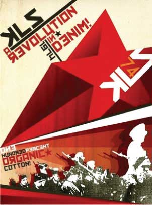
I found this modern soviet poster really effective, looking at it quickly you would not realise thats its a modern poster styled as a soviet propaganda poster.

Colour and Imagery: 
The colours used here are iconic of a russian propaganda poster, the deep reds and oranges with the slightly tinted pale yellow background. I like how the black and white image of the soldiers look as if it is  cotton which relates to the "one hundred percent cotton". The bars of colour used behind these are used in a variety of posters from the 20th century and its really effective how the bars come in from the opposite direction to cut of the image of the soldiers. The 3D style star with its gradient sides create a really sticking impact and feel to the poster and reminds me of some of the soviet space race posters where the stars are shooting across the sky symbolising rocket ships. My eye is drawn in from the point of where the star begins to where it ends and then I'm drawn into the the main body of text. There are 3 stars shown in the poster and from what i can tell its used to fill the gap with some of the text, for example with percent and organic the organic has a star on the end so that it meets the point of where percent ends. I don't think that the drop shadow on the soldiers image would be needed in my poster as from what i have researched its mostly block colour and gradients. 

Text:
The text in this posters is displayed and laid out really effectively, the angled text works with all the other angles within the poster, theres not a vertical or horizontal line in this poster. The font that is used looks very similar to the kremlin font that I have looked at so when recreating this style of poster I will be sure to start with that font first and go from there. The use of exclamation marks and backwards letting is featured heavily again to give a more soviet and russian feel. The 1974 is featured once in full and then the 74 is shown on the star to both repeat it and to give the star a more quirky look along with the KLS text.