Monday 28 November 2011

Evaluation

I have enjoyed this enjoyed this projects, I especially enjoyed learning illustrator and can now see how powerful this piece of software is.

I would not change anything to my final posters I really liked the look and feel of them and I can definitely see that there is a resemblance between my posters and the posters I had decided to change into a 20th century twitter poster.
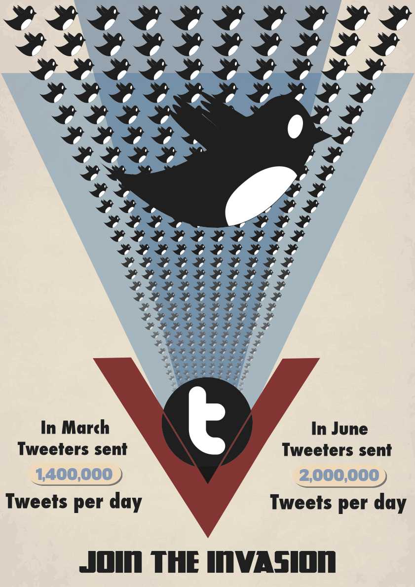
The posters that I chose were from the 1940's from both a Soviet and United states background, I loved the reds of the Russian posters and how they layed out the different imagery and text together to create a quirky and bold poster that was visually bright and impacting considering that most of the posters from that era used very little colours. The RAF/USAF posters use some unique imagery that is iconic to the period, i could also see a direct link between the colours that the existing posters use and twitter.

If I did this project again I would like to make some more posters from the russian period as I like how the  russian poster looks and how the images are made of of very few colours.
The colours that I chose worked well and really made the posters look as if the were 20th century style propaganda posters, the images that I chose although simple were really effective and fit for there purpose, they also not to complicated that they didn't fit the style. 
I found that it was quick to to create the initial design but finishing it off It took me a while to do as I was playing around with the small details for some time getting the right look and feel, the quickest poster for me was the Twitter "Pigeon" poster as it was a trace of the existing poster. The other Twitter soviet poster took the longest as it was the most built up and I added some small details which took time to draw up and add to the correct places so that the poster looked right.

As these posters were to be to be designed to be able to print at A1 ideally I would have liked to print them up at this size however due to cost I decided A3 would be a good size to proof my work, after printing these I noticed some small variations and faults that I did not see on screen. I now have had a chance to fix these and perfect the posters.

I used solely illustrator for my posters in vector format, using and RGB A3 document in which I would change to CMYK for print. I have also created a full resolution PDF of my posters so that they are "flat" compared to my ai document which has layer which I can edit at any stage.


I felt my presentation went ok, I tried to think from memory and make up on the spot some extra details, this went quite badly and i started stumbling and lost where I was with my notes. I feel that i had good content in my presentation but it would have been far better if i had more notes that I could follow.

From my Crit for my presentation I needed to speed up my transitions and lose some of them as it looked a little messy, i would have also liked to include more detailed sketches and ideas from those i know for next time what I need to do


For my Poster Crit the only thing that I needed to change was on the pigeon poster where I could change the hammer to more of a "t" shape, I would also like to try the poster with the twitter bird as it would then be more associated with twitter.


Overall, I really enjoyed the project and would only change somethings as i have stated if i were to repeat this project.

Crit

The constructive criticism that I got was mostly very good, the only thing that I got was to change the hammer into more of a t-shape to resemble twitter.


Sunday 27 November 2011

USSR Bird poster Assessment


This is what I have come up with from my research and design ideas.
Soviet Russian style poster 1940's

Images:

Bird: The bird that I have used looks like a pigeon I would like to try the same effect with the twitter bird logo as it would be more associated with twitter. By using the sharp lines together it creates an gradient, this technique was used widely for 20th century posters as a way to create gradients.

Yellow lines: The dark yellow lines here are used to support the text, they create a quirky look to the poster and looks far better than when I had the text situated flat below the bird.

Sickle and Hammer: The sickle and hammer is used to show the posters as old and propaganda style from the 20th century, I think that the hammer and sickle could be a little bolder and thicker so that it looks more impacting.

Old style and others: Again on this poster I have added a brian to the edges so that it looks older, as before this makes the colours a little darker and more associated with the style that I am going for. I like how plain the poster is and how the one image creates an impacting effect.

Faults: I have found a few faults with this poster after I had printed it out at A3 size.
1st. Some of the text is not aligned correctly.

Crit: To perhaps change the hammer into more of a "t" shape to resemble twitter - I like this idea and will change the shape of it to see what it looks like.

USAF (war plane) poster Assessment


This is what I have come up with from my research and design ideas.
USAF (US) poster 1940's

Images:

Birds: The bird that i have used is the old generation Twitter logo, I chose this logo over the other newer one as I liked having the white parts to the image and it made the birds stand out further on the background. Using the twitter logo instead of the planes give the feeling that twitter is growing ever so fast and coupled with the text looks as if it is an invasion. To give a sense of depth I have lowered the opacity of the birds at the lower end of the poster, it looks as if they are coming from a distance.

Twitter "T": In the original print there is an image of Roosevelt in the centre, by having this it looks as if the planes come from a central point and person, therefore following the trend i used a Twitter "T" as my central image to show that the invasion is coming from twitter. It took me a while to come up with this style as I played around with different ideas with different imagery.

Old style and others: I have added an old style background texture to the poster to make it look older and roughed up, it works with the blue triangles because they have around 50% opacity, this means that I can see the texture from behind it.

Blue Triangle: The blue triangles that I have used are like the existing poster that kind of represent waves that refer to the years in which planes will be made, following this I have used the same style and changed the opacity of the blue so it shows the background through it and when overlapped it comes darker much like the original.

Red "V": The red "V" creates a kind of door in which the birds look as if they are coming from, it really stands out on the page and points to the tag line.

Faults: I have found a few faults with this poster after I had printed it out at A3 size.
1st. Some of the birds look as if they have been stretched.
2nd. The gaps between the red v and blue triangle are not symmetrical .
3rd. There is a dent in the line of birds.
4th. The red lines that go over the "t" do not line up with the "V"

Soviet poster Assessment


This is what I have come up with from my research and design ideas.
Soviet/Russian 1940s styled poster.

Images:

Bird: The bird that i have used is the current Twitter logo, I have made the twitter bird a striking logo by adding lines that originate from a singular point and expand to the bird, by using the gradients on these lines it further in forces that the bird is coming towards you in a sticking fashion. The bird is my main and vertically central image on my posters which to an audience would instantly recognise as Twitter.

Stars: I have used the main big star to give a more russian look/feel to my poster, by having it off the page it looks as if it could be a stamp and further in forces the soviet look. I have also featured another smaller star to balance my text as without it the text looked out of place and a sharp right angled turn on the page in which i did not want.

People: The people symbolise twitter as a group and coming together for a cause in which twitter does as it is a social media site where people talk and socialise together. The image that I have used looks bold and strong as if they are staving towards something, this is also used in existing 20th century russian posters where they have people reaching towards a goal much like the cosmonaut reaching towards the stars.

Hash key sign: The hash key image works extremely well here, russian posters use all sorts of odd shaped shape and designs, the hash key also reminds me of powerlines something which would fit into this poster to show power, the hash sign for twitter represents categorising and works with the search tool found on twitter in which via searching the word with the hash tag becomes the most relevant term.

Text: The text that I had decided to use in the end after playing around with different designs was: Tweet, Twitter, Trends, IOS, Android and SMS. I have chosen these specific words as when trying out different design layouts the words worked well together, the IOS, Android and SMS are all ways in which you can use twitter.

Old style and others: I have added a grain to the edges of the page to make it seem older it also roughens the poster and changes the colours so that it looks more like a soviet poster. The staggered bars of colour are found in a lot of propaganda posters and symbolise anything from the japanese flag to sun rays.

Faults: I have found a few faults with this poster after I had printed it out at A3 size.
1st. The small star touches the line in between the tweet and twitter text.
2nd. Where all the points of the meet the white line shows through the where it should not.
3rd. I would like to Skew the IOS.SMS.ANDROID text to match the lines that it is on.

USAF layout

Here is the style that I'm going for for my USAF poster:
I like the blue birds but i think that the black ones will fit a lot better and are more like the original poster.
I plan to extend he birds to the outer edges and extend them down to the bottom.


Imagery

I have started to draw up my images in illustrator  that I would and could potentially use within each of my posters.
Above: here i was experimenting with different gradients to see what worked best, some of them the bird almost gets lost in the gradient lines and others it looks to unrealistic for the time and look I am going for.

Above: I have decided that I am going for this bird as the gradient on the lines work well and do not blend into the main icon i am wanting the audience to see.


Above: some more potential illustrations that i may use.

Soviet poster text layouts

Here are some of my text layouts after i had sketched them and decided on the wording, angles and colours to use.


Design Choices

The colours that i am going to use will be this palette for my russian style poster:


I have chosen these colours because they are the same colours used in the russian posters from the time (WW2)  I have been looking at, the colours works well together and are iconic of russian propaganda.


This will then be my colour scheme for my USAF poster:

I have chosen these colours because of the relation between twitter and the USAF poster that I want to develop into my twitter poster, the blues are used in both twitter and USAF propaganda posters and the brown as well as the pale yellow are used in posters for the USAF only as this is the style I am wanting to mimic.


Text choices:
I will be using the Kremlin font for my Russian poster as it fits the style i want to ache ice as its bold blocky and has sharp square edges to it.


For my USAF poster I will be using Futura condensed extra bold as its bold tall and looks very impacting on the page.


Russian/Soviet style poster analysis


History:
I found this modern soviet poster really effective, looking at it quickly you would not realise thats its a modern poster styled as a soviet propaganda poster.

Colour and Imagery: 
The colours used here are iconic of a russian propaganda poster, the deep reds and oranges with the slightly tinted pale yellow background. I like how the black and white image of the soldiers look as if it is  cotton which relates to the "one hundred percent cotton". The bars of colour used behind these are used in a variety of posters from the 20th century and its really effective how the bars come in from the opposite direction to cut of the image of the soldiers. The 3D style star with its gradient sides create a really sticking impact and feel to the poster and reminds me of some of the soviet space race posters where the stars are shooting across the sky symbolising rocket ships. My eye is drawn in from the point of where the star begins to where it ends and then I'm drawn into the the main body of text. There are 3 stars shown in the poster and from what i can tell its used to fill the gap with some of the text, for example with percent and organic the organic has a star on the end so that it meets the point of where percent ends. I don't think that the drop shadow on the soldiers image would be needed in my poster as from what i have researched its mostly block colour and gradients. 

Text:
The text in this posters is displayed and laid out really effectively, the angled text works with all the other angles within the poster, theres not a vertical or horizontal line in this poster. The font that is used looks very similar to the kremlin font that I have looked at so when recreating this style of poster I will be sure to start with that font first and go from there. The use of exclamation marks and backwards letting is featured heavily again to give a more soviet and russian feel. The 1974 is featured once in full and then the 74 is shown on the star to both repeat it and to give the star a more quirky look along with the KLS text.

USAF Roosevelt Poster Analysis

http://www.allposters.com/-sp/Victory-Franklin-D-Roosevelt-Posters_i396356_.htm?aid=1035188808&LinkTypeID=1&PosterTypeID=1&DestType=7&Referrer=http%3A%2F%2Fwww%2Esquidoo%2Ecom%2Fpropaganda%2Dposter
History:
This is the poster that I have chosen to develop into my twentieth century style twitter poster. This poster shows Franklin D. Roosevelt the 32nd US president showing his war plane manufacturing plan during world war two. This poster is to display visually what his military airforce plans were between 1942 and 1943. This poster may have been commissioned after the Japanese attacked pearl harbour at the end of 1941 which brought america into ww2.


Colour and Imagery:
The colours used in this poster are really strong and bold, the red "V" placed at the bottom of the blue makes a really contrasting and bold image, the blue triangle which also matches the lines of the red "V"draw your eye down to where the bottom (point) of the triangle would be but instead you see Roosevelt of whom the poster is associated with.
The small attention to detail with the small lines which follow the shape of the "V" look really effective, i think that these lines make having that image in the middle of Roosevelt work, without these lines I don't think it would look right and the image would look out of place. The planes work really well with them looking as if they are coming from Roosevelt which further enforces his war plans of making more war planes. The blue triangles are both the same colour however they also have an opacity lower than 100% which means that when they overlap they become darker and give the effect shown. I like how the planes do not stick to the blue triangle lines, it looks as if there are too many planes and that they will have more than enough to fight with. With the small lines that flow through Roosevelt they meet lower and the circle and instead of jet having the image continue as a circle the image extends the full small length of the triangle. Actually just looking at it more closely i can see that the image actually does stop and it shows the background underneath, I think it would have worked how I said with the image extending.


Text:
The font used for the "war planes" is reasonably bold and a little condensed, i like how there is variation in upper and lowercase lettering and point sizes. The main number uses full stops instead of commas which is different. There is also Roosevelt's signature at the bottom which shows that he has agreed the plan and signed it. There is not a lot of text on this poster which i like as some poster are seemed to be dominated by text.

Air Force RAF Imagery


Using the colour pallet generator again I used multiple posters to get colours from individual posters and then looking at these I generated this singular palette. The rat posters use a mixture blues and also some red to contrast with those blues.


As I have said before the Air force posters use quite a large range of different styled fonts, the ones I liked the look of were the ones that look as if they have been stretched upwards, this effect creates a quite impacting effect, I may not use this exact font but something similar and elongated.


Soviet imagery

I have decided that i will make two posters, an RAF/USAF poster and a Soviet/russian style poster.
This is a colour palette that using "degraeve" (http://www.degraeve.com/color-palette/) which uses an image you give it and creates a palette based on that image, I gave this site 6 images from soviet posters and from that i took the most common colours and created this pallet, you can see the iconic reds and oranges from the soviet era.

 Out of the font I looked at this font came across as the most relevant and similar to existing posters.
This font is called kremlin its thick, blocky, square and the great thing about this font is that the lowercase letters for some letters flips them so that they are backwards and give a russian style and look to the lettering.

Twitter imagery, font and colours

Twitter imagery:


The font for twitter is "PICOBLACKAL" its not really suitable for 20th century posters as its too round and curvy whereas I am going for a big bold and blocky font suitable for my posters.


I have used kuler to make up a colour pallet for me for twitter:

For twitter all of the images, logos and text are all made up of these different shades of blue, by using this colour palette I will be able to implement some of the colours into my poster design, I think that it would go really well with and RAF/USAF poster.

My chosen social media web 2.0

After looking at some propaganda posters I have decided on choosing twitter as my social media site that I am going to promote.
I have chosen twitter over the other because:

A. Twitter has grown massively in the last year and has members joining at an incredible rate, so when looking at posters I could see that there is a link between posters asking people to join the army and to work in the factories, so relating this to twitter I could potentially create a poster getting more people to join.

Ab. Furthering this I have also seen posters asking people to join a majority of people already helping and join the cause, I can then implement the same idea with twitter saying that so many have already joined and that you should join them too.

B. I have never used twitter before so it is something that I may find interesting once I research it in depth.

C. Twitter uses a bird as its logo so I could implement it into an RAF poster

Twitter Research:

Facts:

http://blog.twitter.com/2011/03/numbers.html


#tweets

  • 3 years, 2 months and 1 day. The time it took from the first Tweet to the billionth Tweet.
  • 1 week. The time it now takes for users to send a billion Tweets.
  • 50 million. The average number of Tweets people sent per day, one year ago.
  • 140 million. The average number of Tweets people sent per day, in the last month.
  • 177 million. Tweets sent on March 11, 2011.
  • 456. Tweets per second (TPS) when Michael Jackson died on June 25, 2009 (a record at that time).
  • 6,939. Current TPS record, set 4 seconds after midnight in Japan on New Year’s Day.

I found another really helpful site with lots of statistics and facts on twitter with i will use when planning my posters: http://www.baselinemag.com/c/a/Intelligence/40-Fast-Facts-on-Twitter-890793/

Monday 21 November 2011

Existing 20th Century Web 2.0 posters

http://uploads.neatorama.com/wp-content/uploads
/2011/05/2cc364eb046f7a44.png
http://www.designfloat.com/blog/wp-content/
uploads/2010/10/Someone-Tweeted.jpg


http://creativecreativity.typepad.com/.a/6a00d83451
58fb69e201538f4272b1970b-800wi
http://funstuffcafe.com/wp-content/uploads/2011/08/wash-your-
hands-office-propaganda-steve-thomas-poster.jpg


http://www.usernetsite.com/creativity/show-your
-loyalty-in-the-social-media-war/facebook-join-the-
cause-your-friends-farms-need-you-.jpg
http://adsoftheworld.com/files/images/MMred.jpg

While looking at propaganda posters from the twentieth century I had some posters come up that have been styled as twentieth century posters yet advertise something new from the 21st century.
My favourite poster has to be the m&m poster, the soviet (russian) theme works so well in advertising the red m&m, the image has also been drawn with powerful fists and a hat which further add to the soviet theme.
I also like how on some of the posters here a simple text change of one word for example "talked" into "tweeted" has the same meaning of the original poster yet has a new twist added to it.

I have noticed in a lot of posters not just these that the use of the "sun raise" or "staggered bars" similar to the japanese flag in the posters, its a really good way of showing something coming of the page and it crates a 3D feel to posters. 

Friday 18 November 2011

UK/US WW2 propaganda

http://www.354thpmfg.com/RosterPosters/poster_3.jpg
http://rlv.zcache.com/eyes_of_the_home_skies_civil_air_patrol_
poster-p228302426892659565t5ta_400.jpg

http://www.353thpmfg.com/RosterPosters/poster_3.jpg

http://4.bp.blogspot.com/_ZAn-ABmM9m4/TG7ztd2ONDI/AAAAAAAAJrY/
z-1CPDeRRvM/s640/battle_of_britain_propaganda_poster_mid.jpg

The theme I would like to go along is something on the Raf and airforce front, I really like the style of the posters and I can see a link between my potential choice of twitter as my web 2.0 social media and airforce/Raf posters.
These posters all use blue which resemble the sky, there is also use of red witch contrasts with the blue.
The imagery used is mostly all focused upon their iconic uniforms and their faces. For the "never was so much owed" poster the pilots refereed to as the "few" look happy and want you to show respect and gratitude compared to the other posters which show more serious expressions and give want you to help/show support for the airforce/raf, I want to give a more serious feel to my poster, one of my ideas is to relate to the "America will build" poster and change the aircrafts to the twitter birds.


Imagery:
The images used in this style of poster all relate to aircraft, pilots and the sky. These styles posters use a mixture of hand drawn/painted images and actual photographs, is i am drawing my posters in illustrator in vector format only I will not be using photographs, if I need to use something like a photograph in my poster i would have to trace an existing photo.
The imagery focuses heavily on the pilots, three of them that I have shown hear show the pilots in all the iconic flight gear, the poster with the face coming in from the top right corner you instantly know is a pilot due to the goggles and flying helmet. The poster that I most like here is the War planes poster, from using illustrator I can see how I would replicate it which would be a good start in designing my own poster.


Text:
The text used in these RAF/USAF poster do vary between similar posters unlike the soviet styled ones where you can see a definite style in most of the posters.
The text that I think best suits these posters and that I would use is the text that looks "tall" compered to other fonts, the font really stands out as a main heading, it is used well when it is used in short words and phrases like "YOU" The style of text is bold and in some cases condensed which pushes the letters closer together, in some cases it is used to take up less room but on the top poster it creates a more impacting effect of the word.


The words themselves always have something important to stay that is very impacting, as some of the posters made were to get the public to help a lot of the posters use phrases which want you to help and create an emotional reaction in which to get the public (audience) to help. 


Colour:
The colours used in these posters all focus on the blues and reds and are used in contrasting ways to get the audiences attention. The reds are quite dark (deep,dirty) compared to the blues that are lighter and sometimes overlapped to create darker blues. In these posters the backgrounds always a very pale lightly textured yellow and not a bright "clean" white. The posters mostly use gradients that will build up the image, this is shown clearly on the "eyes of the home skies poster".

Layouts:
The layout of the posters although all different follow the same theme: large text on the top or bottom of the poster with and image filling the opposite space on centre. The "never was so much owed" poster the text is aligned left with the image of the pilots starting high on left, this layout draws your eyers towards the left of the poster and makes you read the text after you have seen the picture so that you know what it is about.


Russian posters


These three russian soviet posters range from 1950s.


Colours: Typical of the USSR/soviets, reds are used heavily on each of the poster designs.
The reds on each of the posters really dominate and become key in the posters:
The first poster is centered around this cosmonaut who is wearing red which also is the actual colour of the russian cosmonauts. The sickle and hammer as well as the shooting stars are also the same colour.
Typography: The text that these russian posters use are mostly all of the same style: big and bold.
These posters focus more on the images than than the text which you would expect for a poster, this means that the text is kept to minimum and used strategically on the design.
For example the text on the second poster has been slanted across the page other than the fourth where it has been placed bottom left. In comparison of poster two and four they look similar and potentially for the same cause, the fourth one carries a similar layout and utilises a more updated/newer look. The fourth poster actually has a rocket shape to the fire, putting the posters together I would look at them as the second one being they were reaching for the stars and then the fourth one shows that they managed it.
The first poster design the text actually curves around what I presume is the earth or another planet/moon, having the text there keeps the overall design quite clean and tidy.
Images: The posters all have an element of reds/oranges in them and the images within the posters are built around these colours: 3: Woman's bandana 4: The hand and rocket/fire 1: Cosmonaut and Sickle 2: The background.
Posters 1,3,4 use a drawn image style unlike the second one which uses a black and white image, the the the black and white image it doesn't really have the same effect as the other three which uses bright colours to draw in the audience.
Historical background: The space race was a part of the cold war between the USA and USSR that started after WW2 involving the handling of Germany after the War and the expansion of communism. Some key and pressured events were the Berlin Blockade (1948–1949), Korean War (1950–1953), Berlin Crisis of 1961, Vietnam War (1959–1975), Cuban Missile Crisis (1962), Soviet war in Afghanistan (1979–1989), Each side developed nuclear weapons aimed at each other, from there the space race was to get missiles to be launched from space, so both the USSR and USA developed instruments for space travel which ranged from putting a satellite into space to landing on the moon.
Style: The style or theme of these posters all relates around reaching up, the cosmonaut holding up the sickle and the hands reaching out, the posters revolve around the reds and oranges that are associated with the soviet union. 

What is WEB 2.0

Web 2.0 is a more advanced version of web 1.0.
Web 2.0 takes web 1.0 to a new level, for example in web 1.0 you had Britannica online which is an online encyclopaedia and then you have wikipedia which takes it further in which it collects information from users and builds up a database of collective information from multiple people. Web 1.0 had home pages and then in web 2.0 focused on blogs and and sharing content. 
http://www.labnol.org/internet/web-3-concepts-explained/8908/

Friday 4 November 2011

What are propaganda posters?

http://www.youthedesigner.com/wp-content/uploads/
2008/05/wwii-propaganda-postersusa1a.jpg
http://cache2.artprintimages.com/p/LRG/9/954/
MY9K000Z/art-print/wwii-raf-spitfire-mightier-yet.jpg

http://img124.imageshack.us/img124/2981/
wwii20wantedjpg4ff.jpg

http://files.sharenator.com/american_3_World_War_Two_
Propaganda_Posters-s350x470-48191-580.jpg


What are propaganda posters?

Wiki: http://en.wikipedia.org/wiki/Propaganda

Propaganda is a form of communication that is aimed at influencing the attitude of a community toward some cause or position so as to benefit oneself or one's group.

As opposed to impartially providing information, propaganda, in its most basic sense, presents information primarily to influence an audience. Propaganda is often biased, with facts selectively presented (thus possibly lying by omission) to encourage a particular synthesis, or uses loaded messages to produce an emotional rather than rational response to the information presented. The desired result is a change of the attitude toward the subject in the target audience to further a political, or other type of agenda. Propaganda can be used as a form of political warfare.
While the term propaganda has acquired a strongly negative connotation by association with its most manipulative and jingoistic examples, propaganda in its original sense was neutral, and could refer to uses that were generally benign or innocuous, such as public health recommendations, signs encouraging citizens to participate in a census or election, or messages encouraging persons to report crimes to the police, among others.

Propaganda is a way of communication to a group of people to hopefully change their attitude towards the cause, for example one of the posters above shows indirectly that by carelessly talking you can cost lives. A lot of propaganda is biased towards the given subject, information is used carefully and in specify ways to influence the audience into believing it. Propaganda posters are designed to get an emotion response from the audience rather than a more conventional approach such as getting a rational response. Overall, propaganda is used to change the opinion of the audience.